we are Grapdes -


Crusoe: A strategic repositioning from a bold explorer to the modern man
industry
Retail Apparel

case study
Crusoe
areas
Brand Immersion & Discovery, Repositioning Strategy, Logo Design, Packaging System, Collateral Design, Brand Ad Film, Website Design & Development
Background
Crusoe, a leading innerwear and activewear brand, had established a strong presence in the markets of Chennai and Coimbatore, centred around a masculine, adventure-driven narrative that appealed to customers seeking active lifestyles and rugged charm.
But times changed. The category evolved. And so did consumers.
Innerwear is no longer just a utilitarian purchase. It is an extension of personal comfort, confidence, and self-identity. The management at Crusoe recognised the need to shift and reached out to us for a strategic rebrand to redefine the brand’s core and go-to-market.
Approach
We began by studying the brand through detailed discovery sessions. This was followed by a research analysis of the market and competitor brands.
This became our north star throughout the rebranding exercise.
Strategic foundation
We defined Crusoe’s purpose as a trusted everyday companion, grounded in comfort and personal relevance.


This shift gives room for the brand to speak to a wider audience across age groups and lifestyles.
We aligned this strategy across product category naming systems, visual identity elements, and other touchpoints of the brand.
Further, to capture the essence of the new identity, we distilled the brand promise into a simple, confident tagline that doesn’t sell aspiration but reflects reality: Wear Your Confidence Every Day.


Visual philosophy
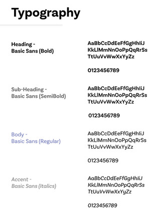
Strategy had set the direction, but the visual philosophy had to complement it. We needed to balance structure with softness. The identity had to remain confident, but feel more open and accessible. We introduced clarity in the design language through soft curves, clean lines, and the considered use of space. We replaced the earlier cues of aggression with a tone of quiet strength. The result was a visual tone that felt bold yet breathable, allowing the brand to be approachable.


Logo


Packaging Collateral


Website design
We developed a D2C website, an essential brand touchpoint, strategically crafted to engage primarily men in the age group of 18–60. The approach blends strong UX, clean navigation, mobile-first design, and use of relevant imagery, balancing brand awareness with ease of shopping to let the brand personality and storefront coexist seamlessly.


Brand Film
To bring the repositioning to life, we conceptualised a brand film that champions real people, reflecting the "Everyman-Hero" ethos. No overproduced visuals. No hyperbole.
Outcomes
Transitioned identity now speaks to a wider audience and fits the evolving sensibilities.
Feels confident but not intimidating, premium but not distant, and grounded in the realities of daily life.
Positioned for seamless expansion across demographics and product lines.
The visual language carries quiet confidence and is easily adaptable across formats
Packaging improves shelf standout and aids quick product differentiation


